Pages
About Me
Links
Tags
PERSONAL 520
SPIRITUAL 416
LDS 312
BOOK OF MORMON 237
SCRIPTURES 154
STUDIO-JOURNEY 129
RELIGION 112
LINUX 79
COMPUTERS 65
LIFE 60
GENERAL CONFERENCE 46
GENTOO 39
MISCELLANEOUS 37
MUSIC 37
PROGRAMMING 33
CARS 29
MICROSOFT 23
FAMILY 23
AUDIO 21
I LOVE MY JOURNAL 18
FUN 15
CHILDREN 12
CURRENT EVENTS 10
NATURE'S WAY 10
VIDEO 9
DRM 9
CONEXM 7
BABBLINGS 7
PROVO CITY CENTER TEMPLE 6
FRIENDS 6
HEROD THE FINK 5
GAMES 5
COMPUTER HARDWARE 5
DRUMS 4
HAND OF GOD 3
ADVERSITY 3
KDENLIVE 3
AUDIO HARDWARE 3
GENERAL INSANITY 3
STUDIO 3
THANKS4GIVING 2
CATS 2
MY JOURNAL 1
POETRY 1
FOREVERGREEN 1
EVERYDAY THOUGHTS 1
GOSPEL 1
PARENTING 1
YOUTH CONFERENCE 1
CHURCH NOTES 1
POLITICS 1
RSS Feed
Thu - Apr 17, 2008 : 04:29 pm
excited
| rated 0 times |
Nature's Way Site is Live!
I've been working on this entry for days, and I think I'm finally ready to get it out there.
But first, let me say that this is quite possibly the most rewarding programming job I've done to date.
I was hired on at Nature's Way last year in June. I was hired on with the understanding that I was to completely re-develop the public Nature's Way web site from the ground up.
The website at the time was done by a firm out of California, written in ASP, served from an IIS server, and backed by an MSSQL database.
They hired me to take on the complete converstion from Microsoft technologies to open source technologies.
I would convert the site to a website served from Apache, written in PHP, and backed by a postgresql database.
So, I started work here, and they told me I needed to program a private website which would track sales. So, I did that and it was in a usable state in December. I programmed the sales reporting site from the ground-up including hardware, operating system, web server, email server, database, cron jobs, file structures, back-end programming, and front-end programming. Not too shabby.
Then, they told me that the public website needed to be done by March. We had a contract, and the new site needed to be live by mid-March. It was then January, and I wasn't 100% sure I could pull it off.
So, I started work on it, and busted it out. I had it done by late February. I then found out the site didn't need to be up until May, so we started on the ehancements before it went live.
I'm writing this entry simply to document a few of the major changes to the web site, and because I'm pretty excited about how it all turned out.
Here's the home page of the old site:
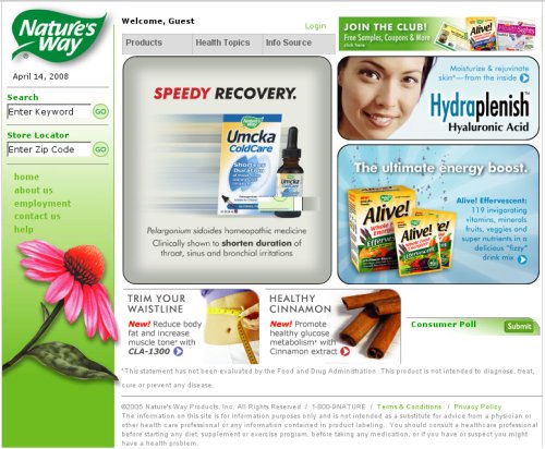 As you can see, there's nothing too great nor too horrible about this site. Some glaring problems are the bottom right-hand poll is non-existent, the whole date thing right above the search bar is, in my opinion, completely un-necessary. Most modern computers can give you the date and time quite easily. I also found it odd that the store locator required you to enter a zip code, and only a zip code. How hard could it be to make it accept city / state combinations as well? Well...
Here's the new one:
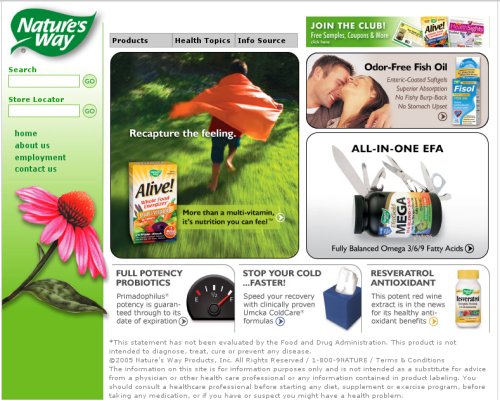
As you can see, very little actually changed with the home page. Some subtle differences are the removing of the "Welcome Guest", along with the ability to log in, removing the poll at the bottom-right, and a few other minor doo-dads.
The spacing between the rounded boxes needed to be improved a bit, and one of the major enhancements is the ability for site admins to plug in as many images as they wish for each image slot, and the site will randomly rotate between them between refreshes. Good stuff.
Now, should you believe the differences in the home page are at all drastic, just you wait.
The code for the old site used a combination of nested tables along with a moderate amount of CSS to control text size and what-not.
The design code actually was very heavily table-based, and didn't look consistent at all between the major competing browsers (IE 6/7 and FF 2). Some functionality wouldn't work at all in Firefox, due to important clickable items being behind other text or images.
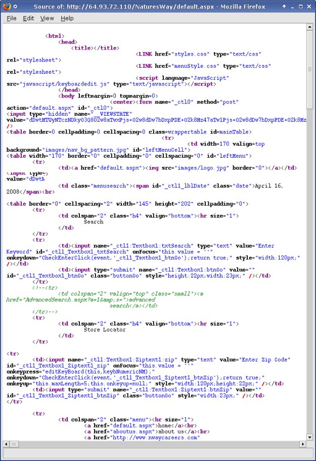
Here's the top portion of the code for the old site:
 and here's the same portion of the new code:
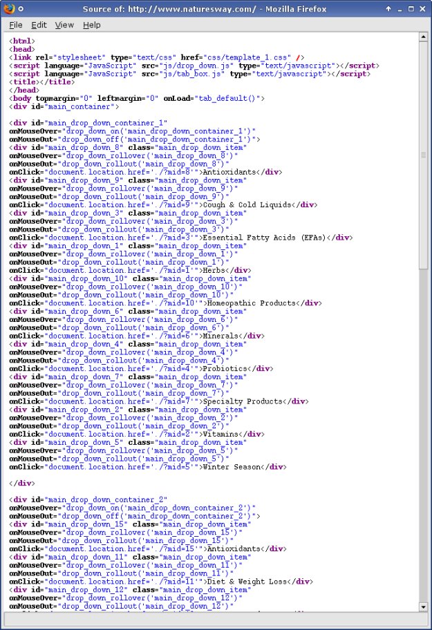 The new code just down the page a little bit is more telling of how the site is actually designed, but I needed to be fair.
The design now uses a table-less layout, entirely written using CSS, and looks very similar, if not identical across all major browsers now.
Now, should you want to click on a menu-item from the "products" drop-down, this is what you would have seen on the old site:
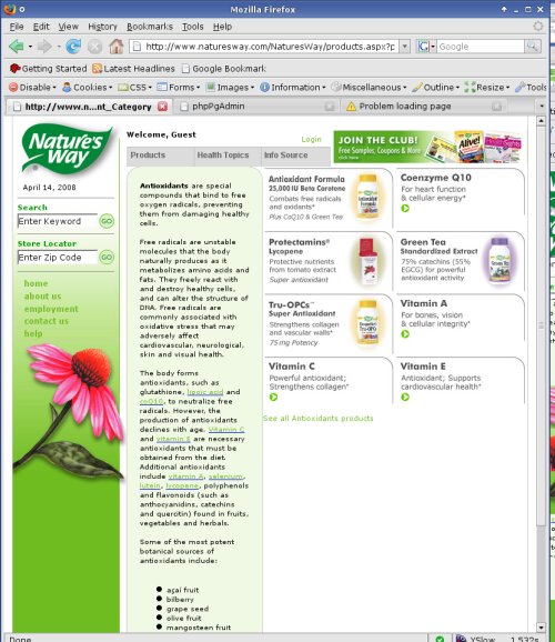 You'll notice the light-green background behind the main informational text... Keep that in mind, because that's the only place you'll see that green background throughout the whole site. Very strange.
Also, the clickable images to the right are ads which are page-specific. Somehow that just wasn't intuitive at all.
Determining where you were within the site also was somewhat of a chore.
The only thing on the site which told you of your whereabouts was the text itself. Here the site speaks of antioxidants, and that's the only way to tell you're on the antioxidant page.
The spacing of the rounded boxes is less than ideal, and the whole layout of the page is very non-intuitive.
You'll notice a small link after the right-hand ads which says "See All Antioxidants Products".
Well, should you click on it, this is what you would get:
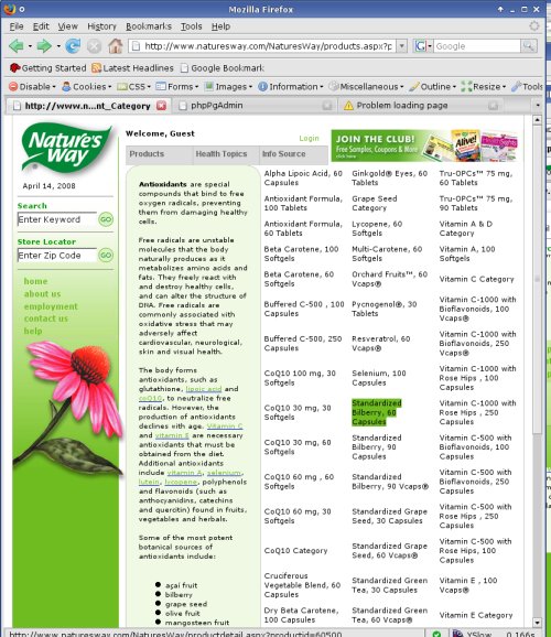 The green highlight is what you saw when you rolled over any of text blobs in the right three columns.
Not sure about you, but this doesn't seem the right way to present this information, at all.
So...
Let's see how
it's supposed
to be done.
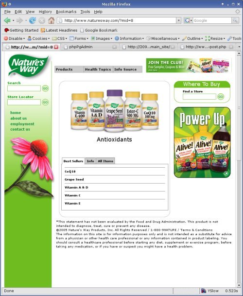
This is the same "antioxidant" page re-done with CSS and a moderate re-design:
Easy to tell where you are? Yes.
A bit easier on the eyes with less text? Yes.
Categorized better, so you know where to go with minimal reading? Yes.
I must admit, adding the combo-box in the center display wasn't my idea. In fact,, I had nothing to do with any of the design, at all.
The funny thing here is that according to the main contact of the old development firm, that simply could not be done. Adding a box which had its own tabs (along with the majority of the enhancement requests of the site search), simply was out of their capability. Interestingly enough, that seemed to be a recurring theme with enhancement requests site-wide, before I was hired.
Here's a screenshot of the "let's see all the products" option:
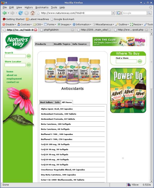 To begin, the method to get a list of all products is much more intuitive with this design.
You simply click on "All Items", and you'll intuitively get a list of all items having to do with the page you are currently browsing. In this case, it's a list of products containing antioxidants.
As you can see, the list is quite long, but in my opinion, it looks a heckuva lot better than having three undiscernable columns with block-text.
Anyway...
I think it looks loads better.
On with the show!
Soon after I was hired, it was obvious what the worst part of the old site was. It seemed like every day someone had something bad to say about the search capability of the website.
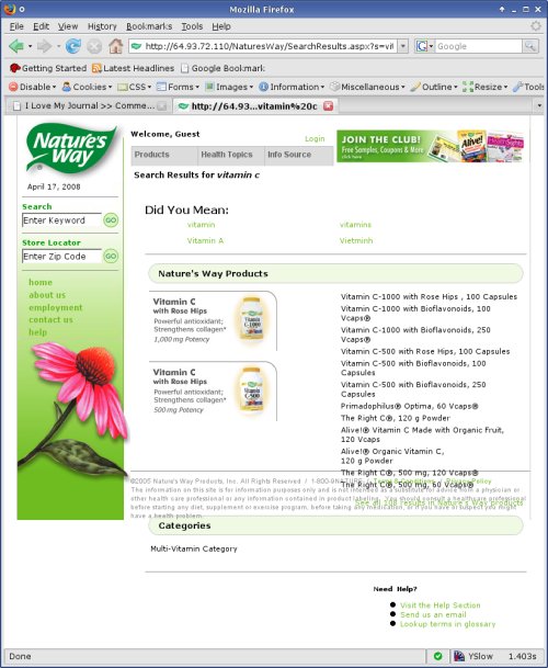 This is a screenshot of the results page for a search for vitamin c.
At first glance, it doesn't seem too bad, but upon a bit of questioning, I soon found out that the development firm told us that they'd have to create a "special algorithm" to be able to search for two-word items such as that. Not quite sure what that was all about.
Another annoyance is the consistent appearance of the "did you mean" section, whether you mis-typed or not. Bad mojo there, my friend.
Then there's the overlapping of words at the bottom (in Firefox), which sometimes made the "categories" section totally unclickable.
All in all, the search results page isn't bad, but apparently the value for the development of the search engine was pretty horrendous.
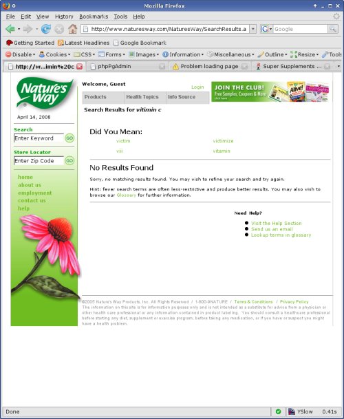 Another feature which they seemed to have missed is what some call fuzzy logic.
Fuzzy logic is the ability to determine what the user really meant, instead of what the user actually typed.
Take, for instance, the mistyping of the phrase "vitimin c", instead of the correct, "vitamin c".
You can plainly see by the picture to the right that the logic which tries to guess the correct words has problems.
I have no idea what type of fuzzy logic they tried to implement, but if it couldn't guess "vitamin c" from "vitimin c", then it had to have problems.
In addition to not guessing the word correctly, the search didn't even try to provide results based on the fuzzy logic. It at least guessed "vitamin" correctly, and I'm sure could have provided some results for the user, but instead, it says it couldn't find anything.
Not a very efficient way to program a search engine in my opinion.
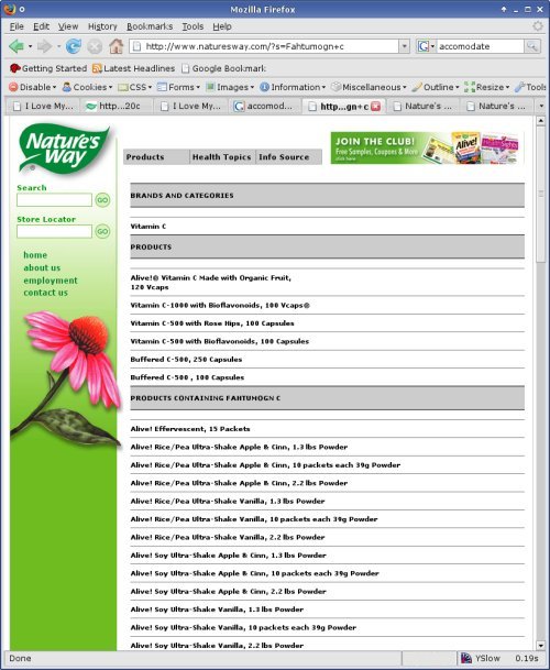 The new site's search engine was written entirely from scratch, and I must say, it wasn't too terribly difficult to program.
The sectioning of the results isn't quite as elaborate as the one before, but it's very easy to read and the results provided, I believe, are much more coherent.
The search engine was designed using a marvelous feature of PHP called "metaphone".
A metaphone is basically just a dumbed-down version of english. It uses a much more generic representation of the words, and thus can accommodate slight mis-spellings pretty well.
So, the screenshot to your left now is actually a more blatantly mis-spelled version of the first search we did on the old site. The search is for the mis-spelled phrase, "Fahtumogn c".
As you can see, the results are identical to the search for "vitamin c", but you wouldn't even be able to tell, unless you looked at the URL which represents the actual word typed in.
Kinda cool, eh'?
Of course, if you mis-spell a word too drastically, it won't find anything, but it would take a mis-spelling which made the word phonetically different.
Anyway... Those are just a few of the enhancements we made here at Natures Way.
I just needed to let the world know how excited I am to be working on this project, and to actually have it go live.
Goooood stuff!
But first, let me say that this is quite possibly the most rewarding programming job I've done to date.
I was hired on at Nature's Way last year in June. I was hired on with the understanding that I was to completely re-develop the public Nature's Way web site from the ground up.
The website at the time was done by a firm out of California, written in ASP, served from an IIS server, and backed by an MSSQL database.
They hired me to take on the complete converstion from Microsoft technologies to open source technologies.
I would convert the site to a website served from Apache, written in PHP, and backed by a postgresql database.
So, I started work here, and they told me I needed to program a private website which would track sales. So, I did that and it was in a usable state in December. I programmed the sales reporting site from the ground-up including hardware, operating system, web server, email server, database, cron jobs, file structures, back-end programming, and front-end programming. Not too shabby.
Then, they told me that the public website needed to be done by March. We had a contract, and the new site needed to be live by mid-March. It was then January, and I wasn't 100% sure I could pull it off.
So, I started work on it, and busted it out. I had it done by late February. I then found out the site didn't need to be up until May, so we started on the ehancements before it went live.
I'm writing this entry simply to document a few of the major changes to the web site, and because I'm pretty excited about how it all turned out.
Here's the home page of the old site:
As you can see, there's nothing too great nor too horrible about this site. Some glaring problems are the bottom right-hand poll is non-existent, the whole date thing right above the search bar is, in my opinion, completely un-necessary. Most modern computers can give you the date and time quite easily. I also found it odd that the store locator required you to enter a zip code, and only a zip code. How hard could it be to make it accept city / state combinations as well? Well...Here's the new one:
As you can see, very little actually changed with the home page. Some subtle differences are the removing of the "Welcome Guest", along with the ability to log in, removing the poll at the bottom-right, and a few other minor doo-dads.
The spacing between the rounded boxes needed to be improved a bit, and one of the major enhancements is the ability for site admins to plug in as many images as they wish for each image slot, and the site will randomly rotate between them between refreshes. Good stuff.
Now, should you believe the differences in the home page are at all drastic, just you wait.
The code for the old site used a combination of nested tables along with a moderate amount of CSS to control text size and what-not.
The design code actually was very heavily table-based, and didn't look consistent at all between the major competing browsers (IE 6/7 and FF 2). Some functionality wouldn't work at all in Firefox, due to important clickable items being behind other text or images.
Here's the top portion of the code for the old site:
and here's the same portion of the new code:The new code just down the page a little bit is more telling of how the site is actually designed, but I needed to be fair.The design now uses a table-less layout, entirely written using CSS, and looks very similar, if not identical across all major browsers now.
Now, should you want to click on a menu-item from the "products" drop-down, this is what you would have seen on the old site:
You'll notice the light-green background behind the main informational text... Keep that in mind, because that's the only place you'll see that green background throughout the whole site. Very strange.Also, the clickable images to the right are ads which are page-specific. Somehow that just wasn't intuitive at all.
Determining where you were within the site also was somewhat of a chore.
The only thing on the site which told you of your whereabouts was the text itself. Here the site speaks of antioxidants, and that's the only way to tell you're on the antioxidant page.
The spacing of the rounded boxes is less than ideal, and the whole layout of the page is very non-intuitive.
You'll notice a small link after the right-hand ads which says "See All Antioxidants Products".
Well, should you click on it, this is what you would get:
The green highlight is what you saw when you rolled over any of text blobs in the right three columns.Not sure about you, but this doesn't seem the right way to present this information, at all.
So...
Let's see how
it's supposed
to be done.
This is the same "antioxidant" page re-done with CSS and a moderate re-design:
Easy to tell where you are? Yes.
A bit easier on the eyes with less text? Yes.
Categorized better, so you know where to go with minimal reading? Yes.
I must admit, adding the combo-box in the center display wasn't my idea. In fact,, I had nothing to do with any of the design, at all.
The funny thing here is that according to the main contact of the old development firm, that simply could not be done. Adding a box which had its own tabs (along with the majority of the enhancement requests of the site search), simply was out of their capability. Interestingly enough, that seemed to be a recurring theme with enhancement requests site-wide, before I was hired.
Here's a screenshot of the "let's see all the products" option:
To begin, the method to get a list of all products is much more intuitive with this design.You simply click on "All Items", and you'll intuitively get a list of all items having to do with the page you are currently browsing. In this case, it's a list of products containing antioxidants.
As you can see, the list is quite long, but in my opinion, it looks a heckuva lot better than having three undiscernable columns with block-text.
Anyway...
I think it looks loads better.
On with the show!
Soon after I was hired, it was obvious what the worst part of the old site was. It seemed like every day someone had something bad to say about the search capability of the website.
This is a screenshot of the results page for a search for vitamin c.At first glance, it doesn't seem too bad, but upon a bit of questioning, I soon found out that the development firm told us that they'd have to create a "special algorithm" to be able to search for two-word items such as that. Not quite sure what that was all about.
Another annoyance is the consistent appearance of the "did you mean" section, whether you mis-typed or not. Bad mojo there, my friend.
Then there's the overlapping of words at the bottom (in Firefox), which sometimes made the "categories" section totally unclickable.
All in all, the search results page isn't bad, but apparently the value for the development of the search engine was pretty horrendous.
Another feature which they seemed to have missed is what some call fuzzy logic.Fuzzy logic is the ability to determine what the user really meant, instead of what the user actually typed.
Take, for instance, the mistyping of the phrase "vitimin c", instead of the correct, "vitamin c".
You can plainly see by the picture to the right that the logic which tries to guess the correct words has problems.
I have no idea what type of fuzzy logic they tried to implement, but if it couldn't guess "vitamin c" from "vitimin c", then it had to have problems.
In addition to not guessing the word correctly, the search didn't even try to provide results based on the fuzzy logic. It at least guessed "vitamin" correctly, and I'm sure could have provided some results for the user, but instead, it says it couldn't find anything.
Not a very efficient way to program a search engine in my opinion.
The new site's search engine was written entirely from scratch, and I must say, it wasn't too terribly difficult to program.The sectioning of the results isn't quite as elaborate as the one before, but it's very easy to read and the results provided, I believe, are much more coherent.
The search engine was designed using a marvelous feature of PHP called "metaphone".
A metaphone is basically just a dumbed-down version of english. It uses a much more generic representation of the words, and thus can accommodate slight mis-spellings pretty well.
So, the screenshot to your left now is actually a more blatantly mis-spelled version of the first search we did on the old site. The search is for the mis-spelled phrase, "Fahtumogn c".
As you can see, the results are identical to the search for "vitamin c", but you wouldn't even be able to tell, unless you looked at the URL which represents the actual word typed in.
Kinda cool, eh'?
Of course, if you mis-spell a word too drastically, it won't find anything, but it would take a mis-spelling which made the word phonetically different.
Anyway... Those are just a few of the enhancements we made here at Natures Way.
I just needed to let the world know how excited I am to be working on this project, and to actually have it go live.
Goooood stuff!